Bucking the Trend: The Brain and Date of Homo naledi
 |
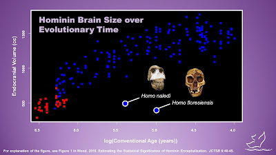
| Based on a diagram from Wood (2016) (see below for full reference). Blue points represent Homo and red points represent all other hominin genera. |
There's a famous diagram going around that purportedly demonstrates continuous human evolution from nonhuman ancestors. It apparently was popularized by Nick Matzke back when the Panda's Thumb blog was still posting pretty regular content. See his original post here. In a followup on his website, he cautions that his data should be used wisely, or as he says, "don't be naive when you use the data."
Despite his reasonable warning, I've always felt that the diagram was misused in the zeal to refute creationists, primarily by ignoring phylogeny. Despite some paleontologists' preference for the march-of-progress view of human evolution, the more realistic and biological view is one of a branching tree (or better, as Lee Berger describes it, a braided stream). It seemed like too many people were using that diagram to emphasize a simplistic view of gradualistic emergence of modern humanity. For example, the diagram includes the "robust australopithecines" that are now placed in a separate genus Paranthropus and are thought to be a side branch of human evolution. It was as if otherwise sensible scientists were thinking, "Let's take a giant step backward in our understanding of evolution so we can score points against creationists."
So when I was putting together my response to Homo naledi last year, I decided to revisit the question (inspired at the time by reading RTB's latest human origins book). You can read the technical details here:
Wood. 2016. Estimating the Statistical Significance of Hominin Encephalization. JCTSB 6:40-45.
In the paper, I concluded that there was definitely a trend, even when examined phylogenetically. The closer you get to Homo sapiens (in radiometric time or on the phylogeny), the larger the average brain size gets. The trend happens exclusively in Homo, though, which I thought was really interesting. At the time I published that paper, the main exception was Homo floresiensis, the small hominin discovered in Indonesia. He has a small brain size but lived relatively recently. With the new dating result from Homo naledi, we can now add another point to that diagram, and you see that the trend is starting to get a little messy. There are now two significant outliers from the main line of increasing brain size.
Don't read too much into that, though. Two outliers aren't enough to negate a statistically significant trend, but they are intriguing. And they make me wonder what else is out there just waiting to be discovered?
Feedback? Email me at toddcharleswood [at] gmail [dot] com. If you enjoyed this article, please consider a contribution to Core Academy of Science. Thank you.